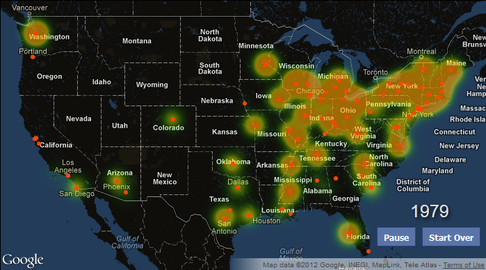
My latest project has been to take a career’s worth of Bruce Springsteen tour dates (data courtesy of The Timoney Group) and try to make sense of it all. While I admit to being just a casual fan of Springsteen, working on this project has given me an understanding of the tireless performer he is. The data encompasses more than 1,500 tour dates over 40 years. In the beginning of his career, in fact, he would often perform multiple shows in one night.
Behind the scenes, the main map is a just a stylized version of the familiar google map interface that we all know and love. Data is loaded from two JSON files; concert dates and album information. The construction of the Heat Map itself is handled by feeding the data to a Google HeatMap layer (part of the ). The tricky part is the animation. While constructing a static Heat Map is a piece of cake, Google does not provide any quick and easy built-in functions or methods to accommodate animation. Luckily, Google does provide something called an MVC Array. By using this type of array as the data source for the Heat Map, we can add and remove concert data and have these changes dynamically reflected in the HeatMap layer.
Aside from that complex piece of javascript, it’s mostly just a matter of some simple html and css to construct the layout. The scrolling ticker of venues is a jquery plugin.
The intensity of the heat map is based on relative popularity. Since the East Coast is very densely populated, any band would seem wildly popular there compared to the rest of the country. The solution is to weight the size of the concert relative to the surrounding metropolitan area. Thus, the heat map intensity of an arena show in New York City (pop. ~9,000,000) is just a flash in the pan compared to that of any show in Iowa City (pop. ~150,000). Still, even with this adjustment Springsteen’s popularity in the Northeast and in the Rust Belt can’t be overstated.
Click here to view the animation. A great writeup based on this visualization can be found here.
And, if you’re curious, Springsteen is on tour right now.


This knocks my socks off. Cool.
The population adjustment procedure, of course, only works if it is “popularity” that you are interested in. As it stands, that word isn’t used in the map title, so for me at least, I viewed the map as being a more straightforward “where did Springsteen tour”…which would not have to be adjusted for population. Plus, we all know venues aren’t booked solely (if much at all) on fan-base locales and more to do with population centers, venues, etc. These are small items compared to the overall map’s aesthetic design, however.